Istation “Letter Books” — Bilingual Early-Learning Story Series
Overview
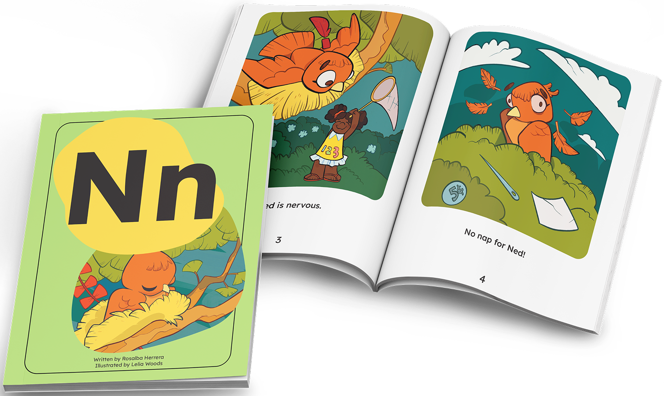
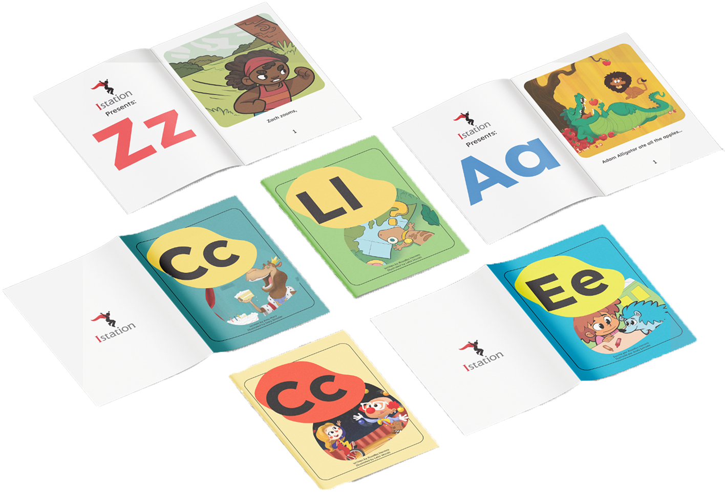
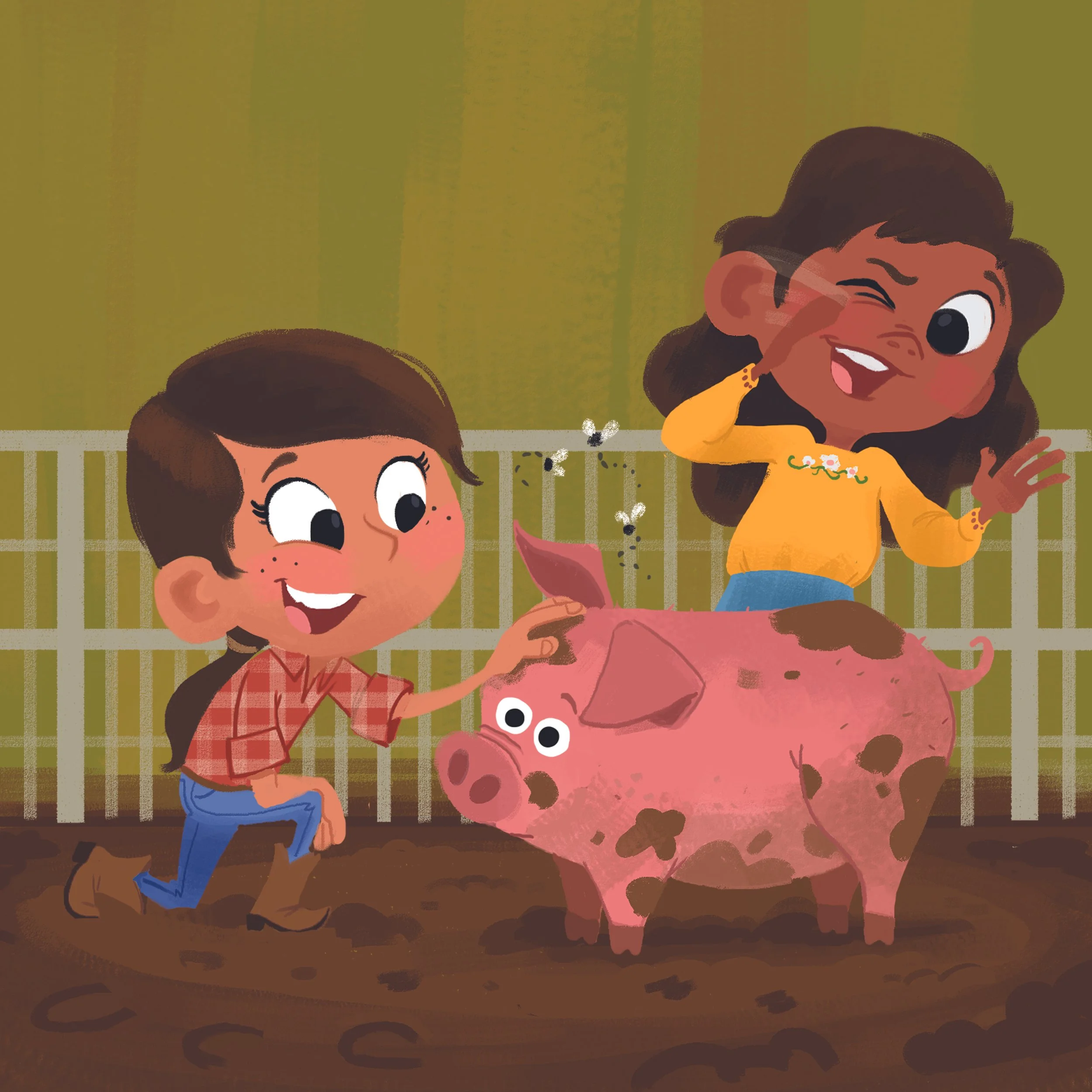
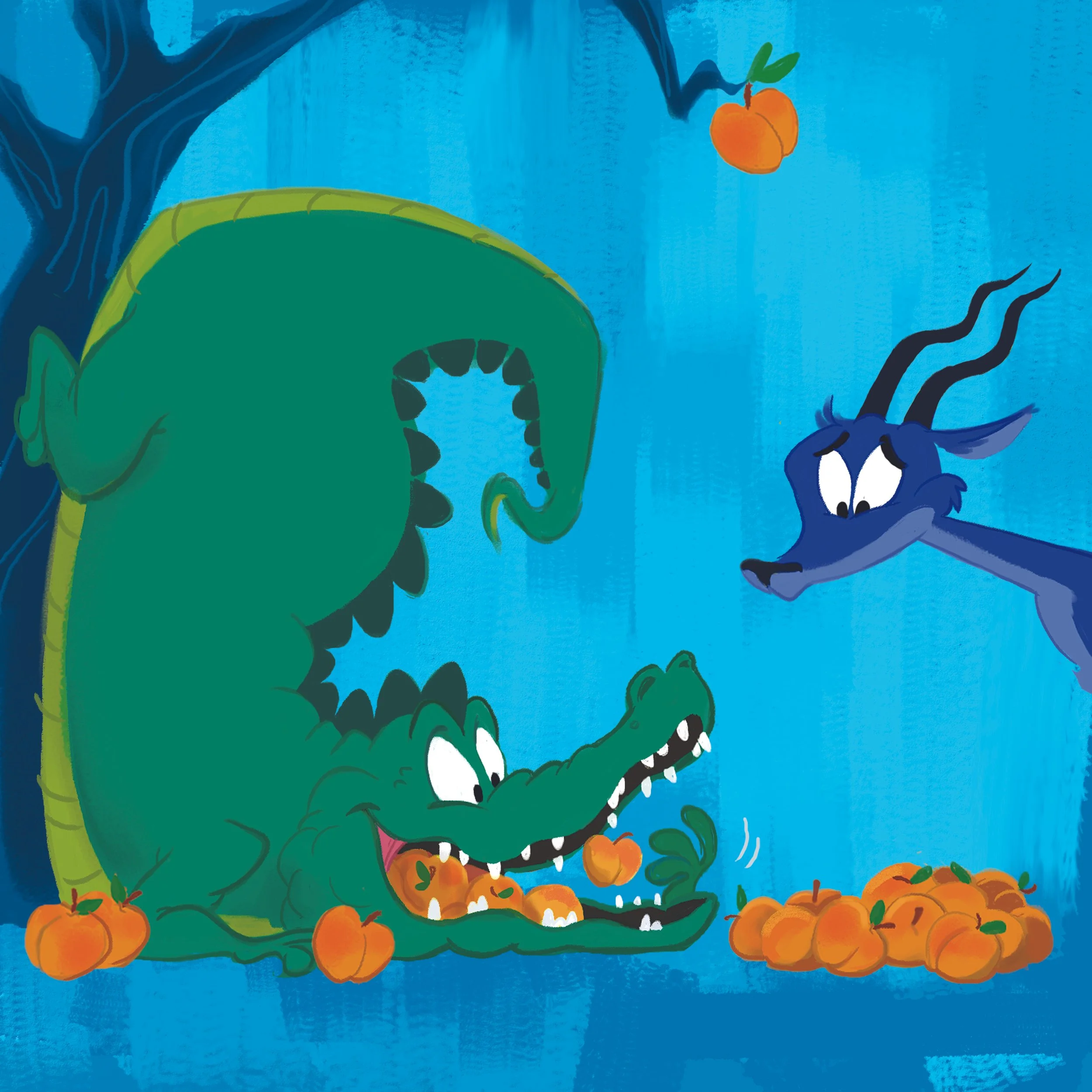
Istation: Letter Books is a series of short 3–4 page stories created for Pre-K and Kindergarten students, produced in both English and Spanish to support bilingual literacy. As the Design & Layout Lead, I directed the visual system for the entire series, ensuring consistency, readability, and classroom-friendly accessibility.
This collection was written by educational professionals and designed to integrate seamlessly into early-learning reading programs. My role spanned layout design, art direction, asset organization, and production workflow management.
Project Type
Design Direction
Layout Systems
Art Guidelines
Accessibility
Role
Lead Designer
Art Director
Tools & Programs
Adobe InDesign
Deliverables
Layout Templates
Art Guidelines
Bilingual Book Series
Accessible Print Versions
Acknowledgments
A special thanks to the talented artists who helped bring these stories to life:
Lelia Woods, Greg Shrader, and Andy Estrada.
Project Objective
Create a scalable design system for a bilingual early-learning book series that maintained visual consistency across dozens of stories, supported reading comprehension for young learners, and reduced friction for teachers using the materials in real classroom environments.
PHASE 1
Understanding the Letter Books Series
Audience & Intent
The Letter Books were crafted as beginner-friendly stories to introduce young learners to key literacy concepts. My design approach supported:
Early reading comprehension
Clear visual hierarchy
Simple, predictable pacing
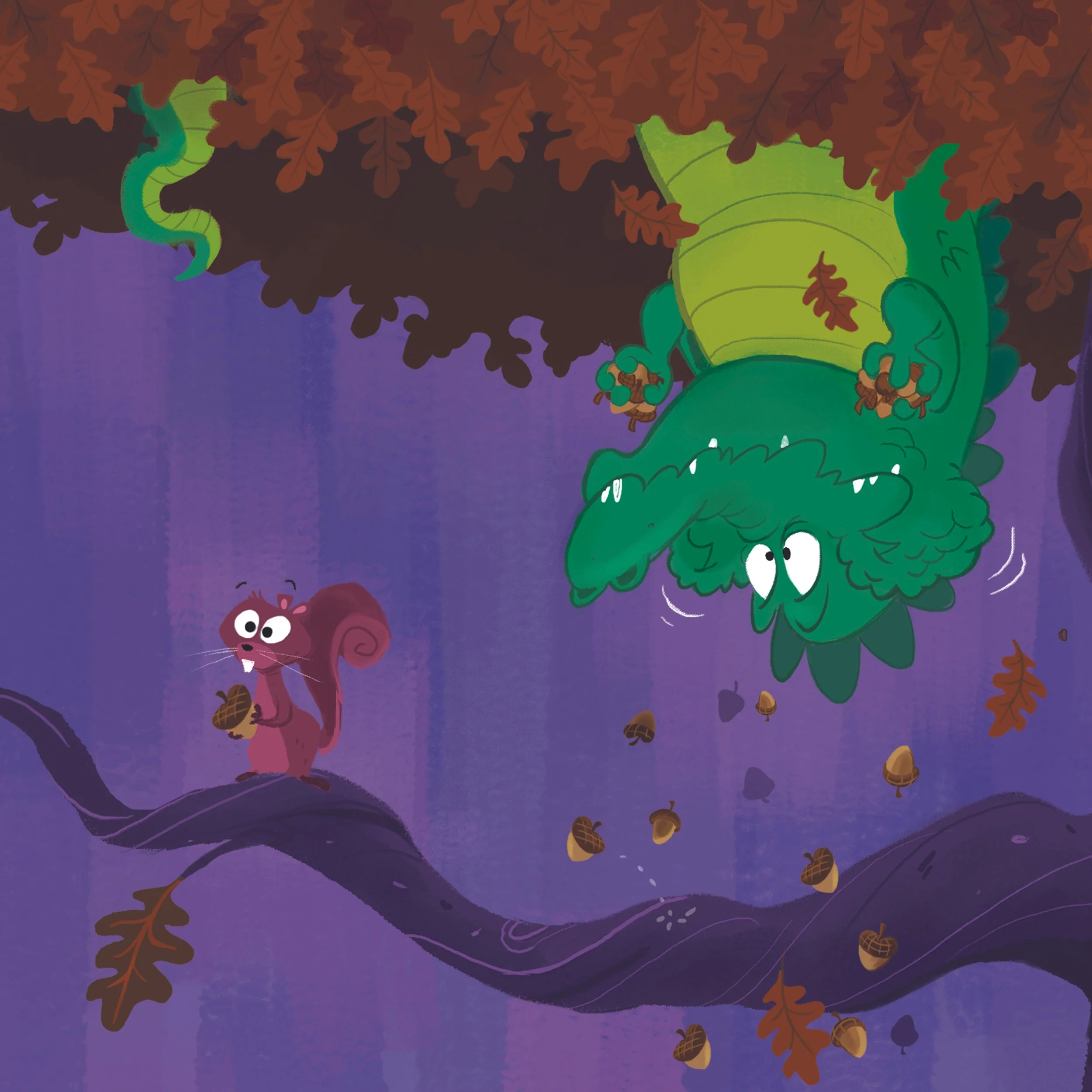
Child-appropriate illustration styles
Each story was produced in an English and Spanish version, requiring adaptable layouts that preserved structure while respecting language differences.
PHASE 2
Layout & Template System
Building the InDesign Framework
I created an Adobe InDesign template that served as the foundation for all books in the series.
What the System Included
Master page variations for pacing and text placement
Defined typography styles tailored to early readers
Layouts that accommodated bilingual text without sacrificing readability
Production-ready structure for fast turnaround
This framework ensured visual consistency and significantly reduced production time as new titles were added.
PHASE 3
Production Workflow & Stakeholder Collaboration
Managing Designers, Artists, and Review Cycles
To maintain consistent quality throughout the series, I coordinated with both in-house artists and an external contractor.
Responsibilities Included
Directing core visual decisions for the series
Managing timelines, feedback cycles, and revision rounds
Reviewing files for quality, accuracy, and print readiness
Communicating art expectations and ensuring narrative alignment
This organized workflow helped the team stay efficient, aligned, and ahead of production deadlines.
PHASE 4
Art Direction & Asset Guidelines
Creating Clear Art Guidelines
I established art guidelines that supported:
Consistent illustration style across all titles
Readability and storytelling clarity for beginning readers
Simplified processes for illustrators and production staff
Alignment with children’s publishing trends and educational best practices
The guidelines served as a shared source of truth, increasing efficiency across the entire creative team.
PHASE 5
Accessibility Enhancements
Designing for Classroom Realities
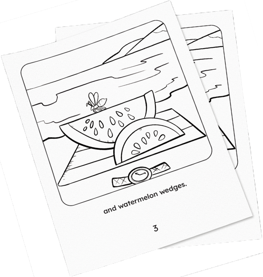
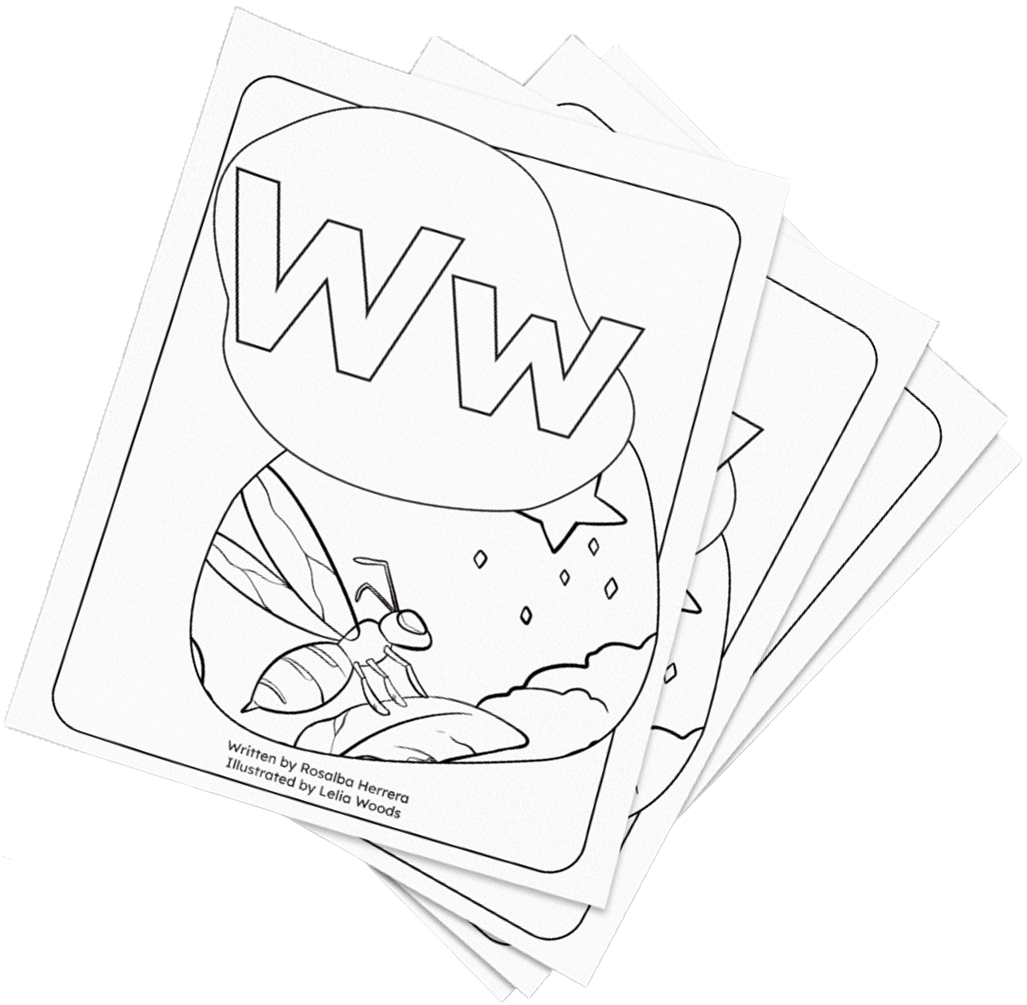
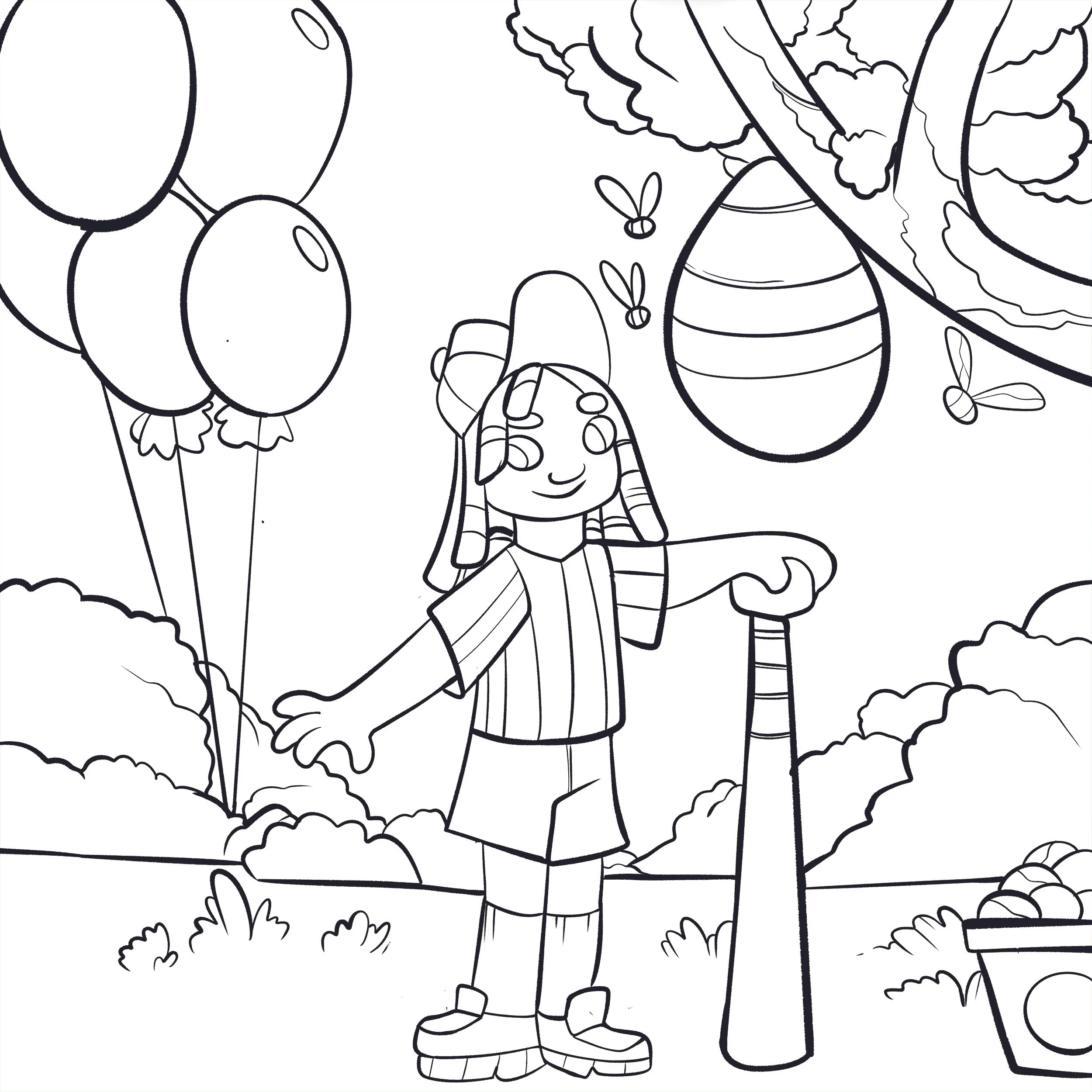
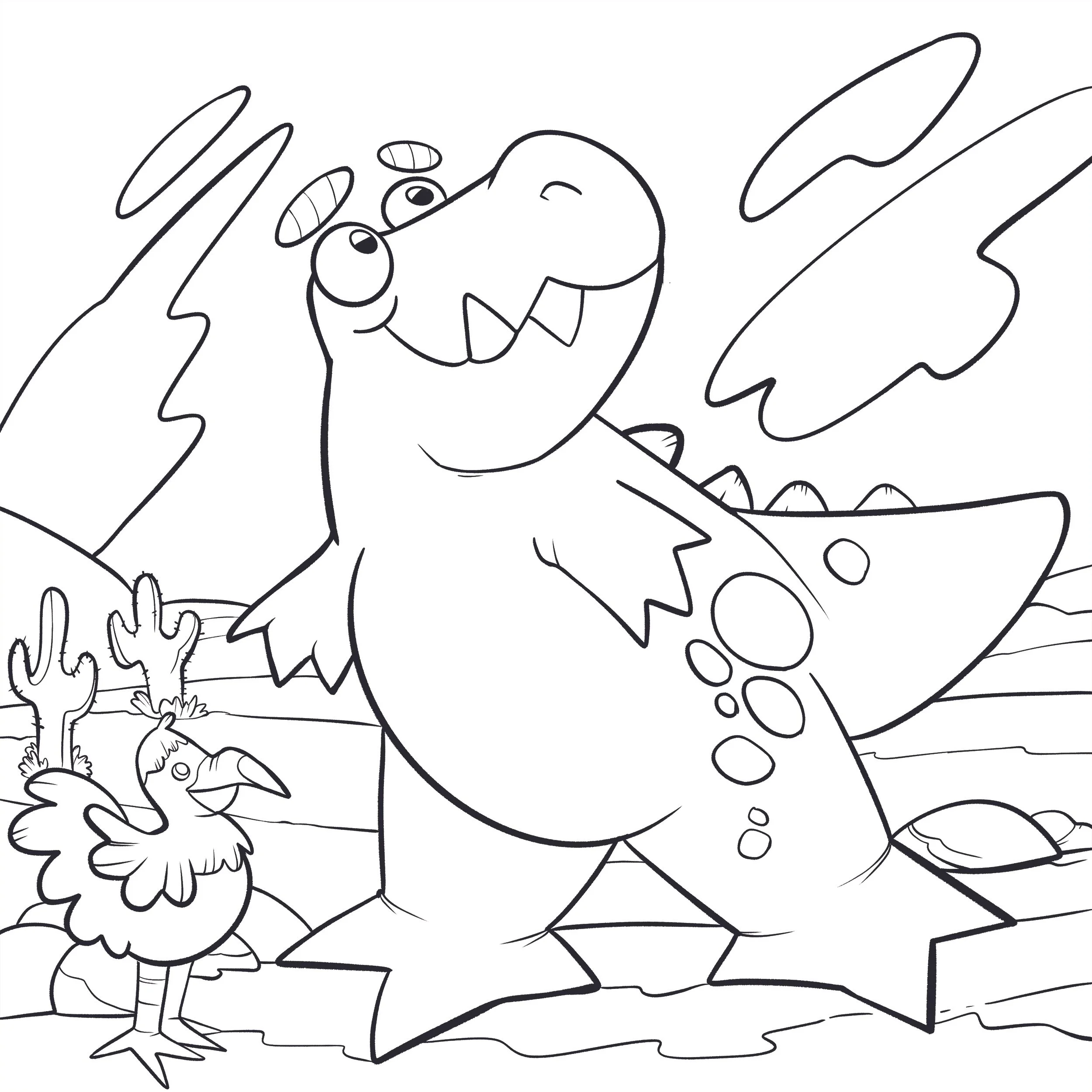
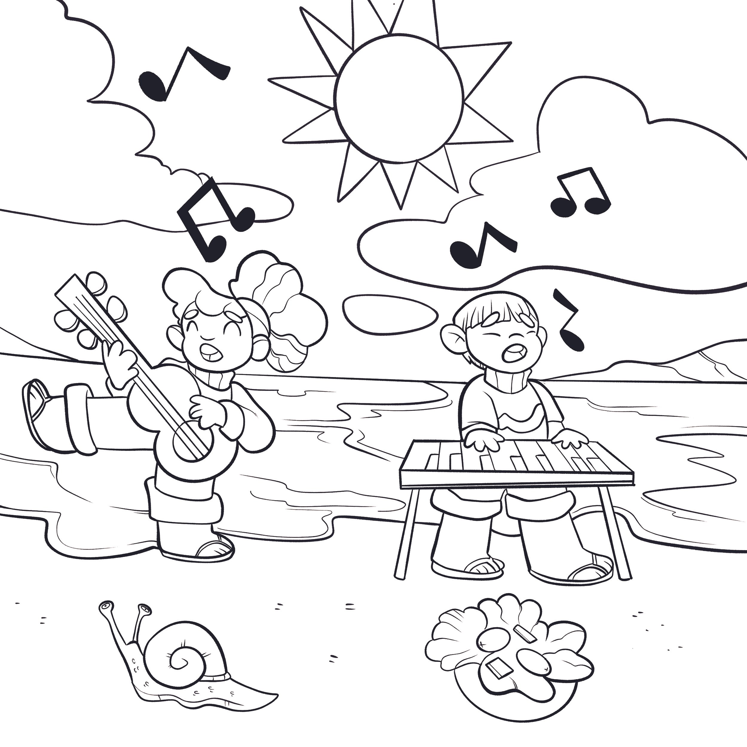
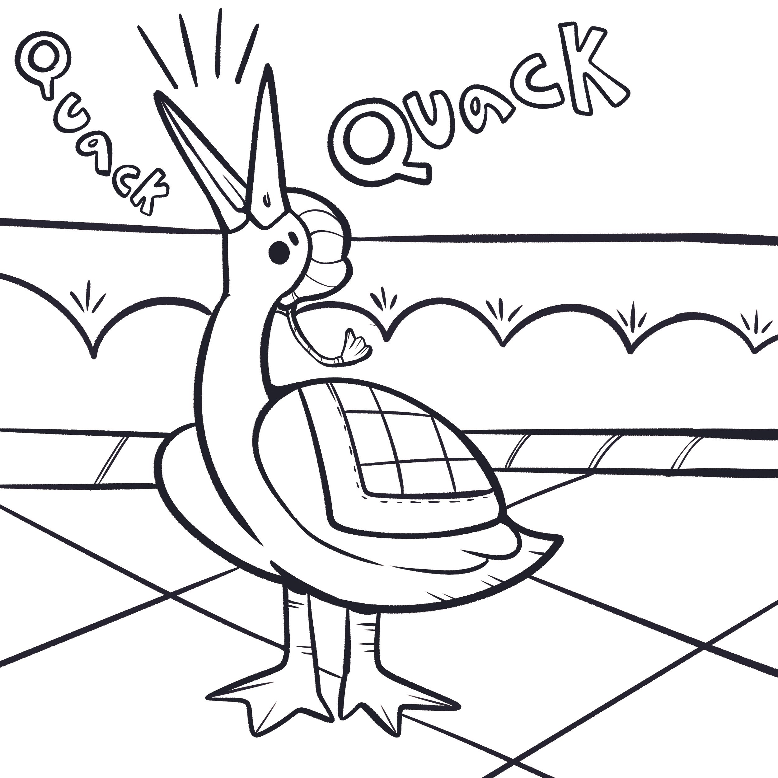
Teachers frequently print these books on standard black-and-white printers. To support this need:
Accessibility Solutions
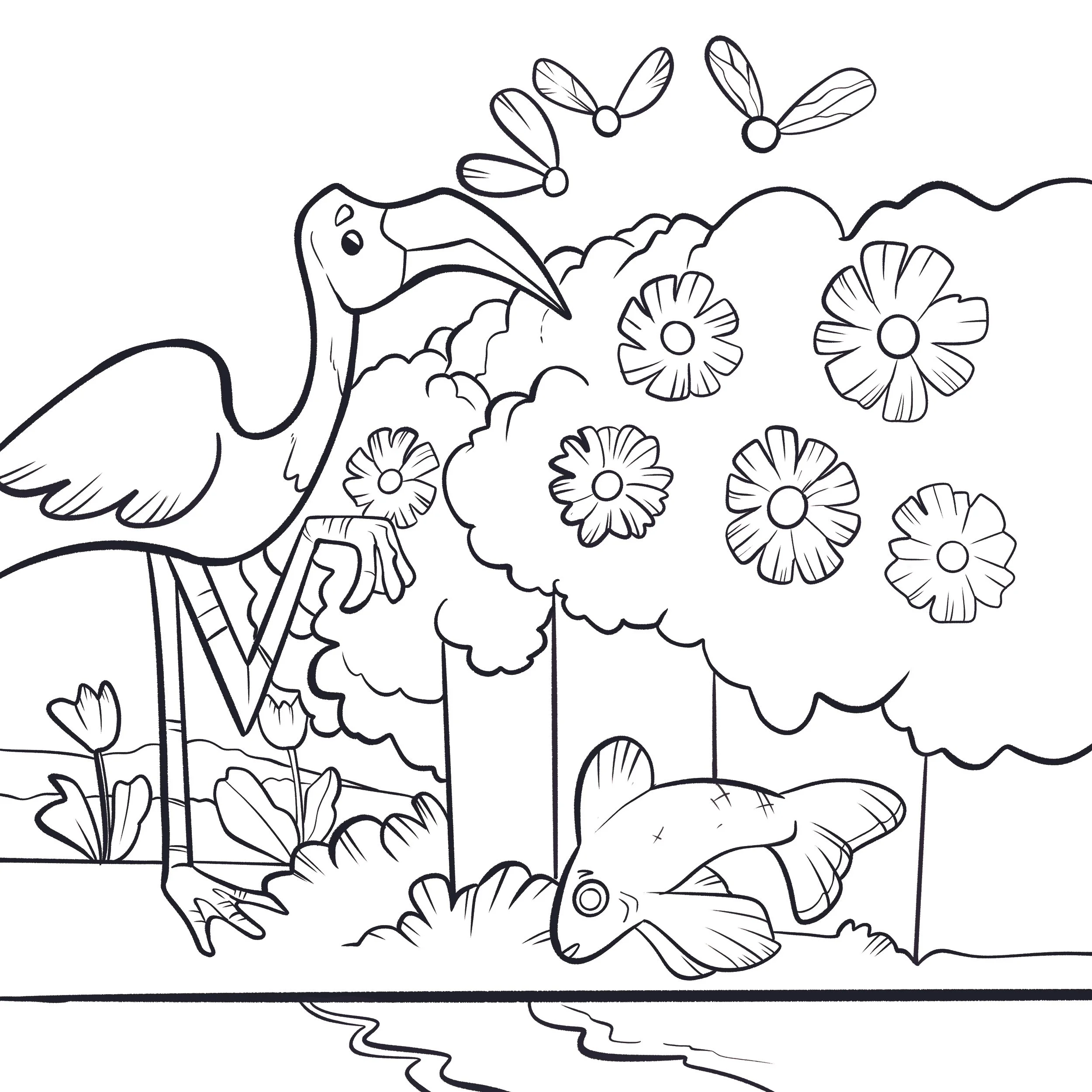
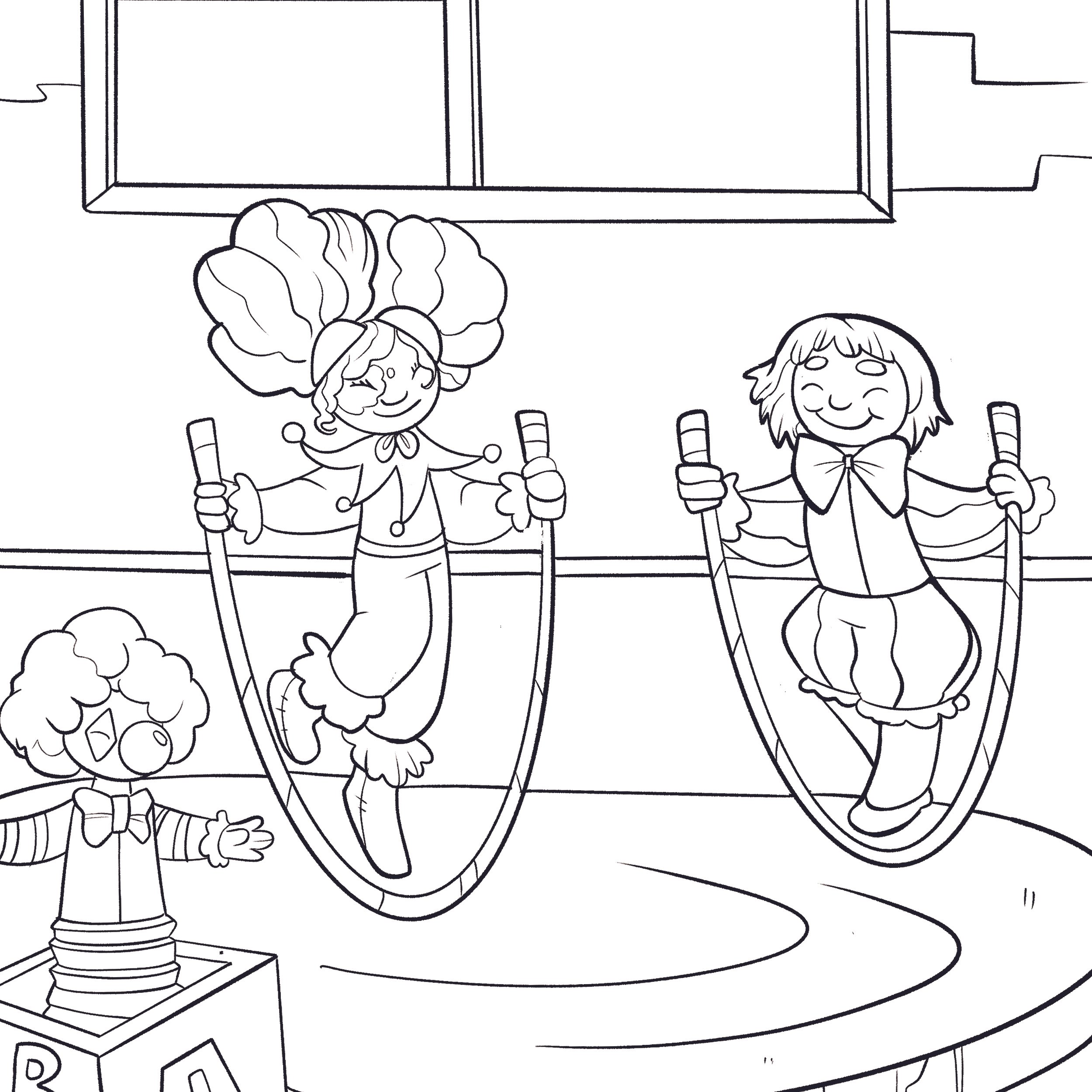
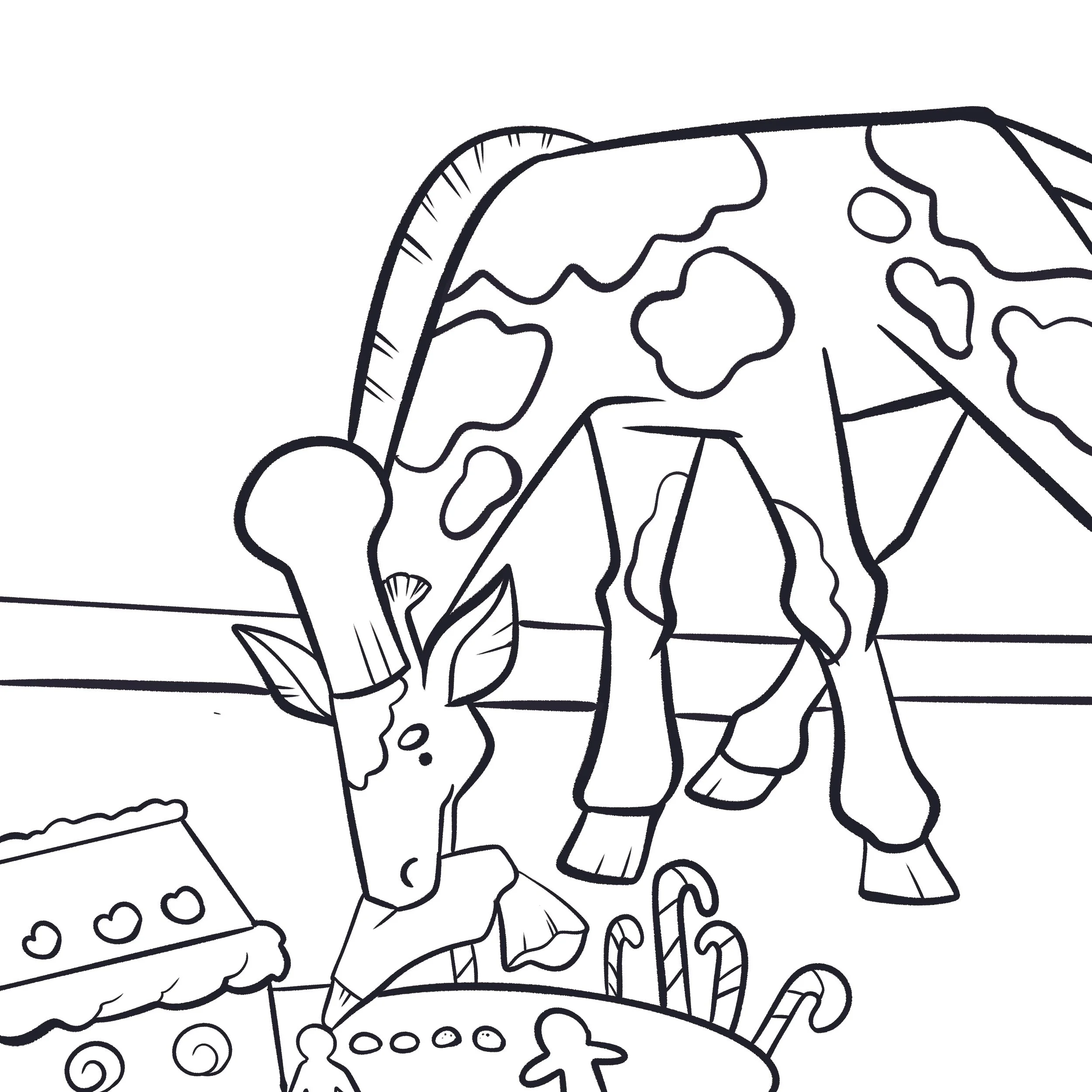
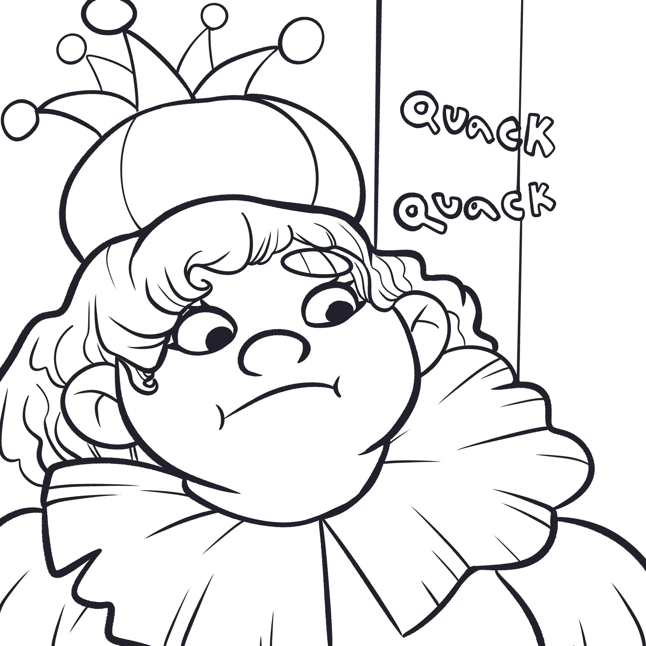
Replaced grayscale artwork with line-art illustrations
Reduced ink usage, improving affordability for educators
Ensured visuals remained clear and student-friendly
Maintained narrative clarity even in simplified formats
This accessibility layer removed barriers while preserving engagement for early learners.
Results & Impact
A fully scalable bilingual book system
Strong, unified visual identity across dozens of titles
Faster production from reusable templates
Improved accessibility for teachers and students
Efficient workflows for artists and the production team